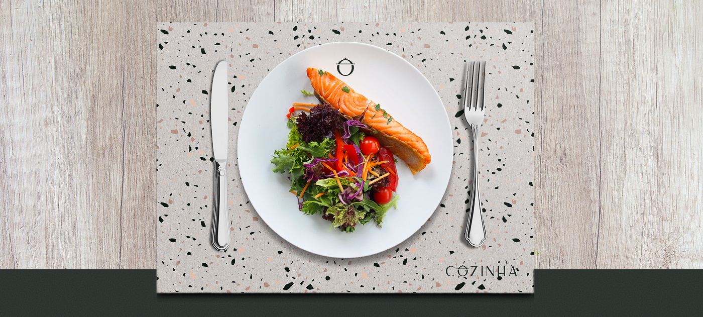

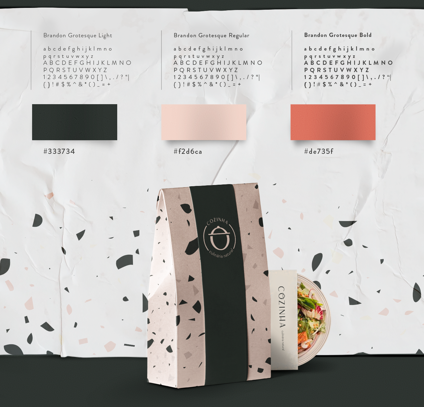
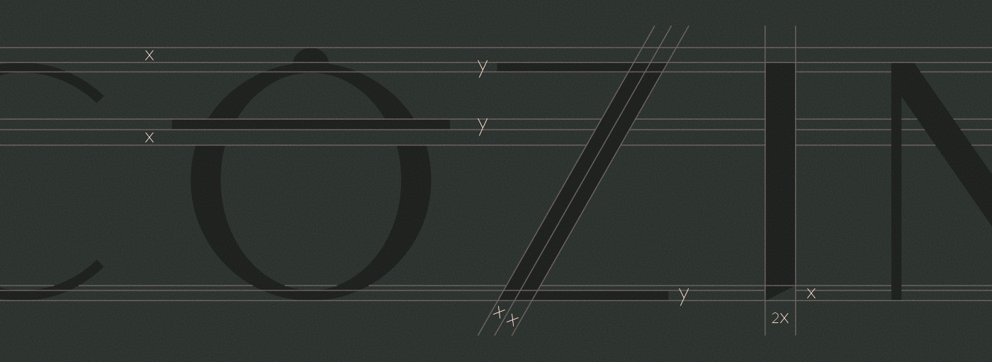
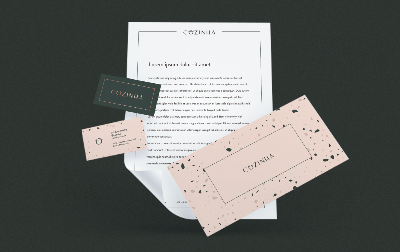


The restaurant “Cozinha” was all about fine dining with a menu based on organic and unprocessed ingredients. The thought process behind it was to pick some elements that relates to organic and natural diet, like earthy tones from vegetables and grains, and incorporate them to a chic and precise design. That's mirrored in the color palette, patterns and typography. The detail in the letter "o" that creates the symbol was the way to bring more personality to the logo and enrich the identity. Unfortunately, this project went to a whole different direction due to some core changes in the briefing, so it's not the approved version, but I like this one better.